 Recently I have made a number of major changes in the design of TOPIK GUIDE website. Everything has been changed including logo, the placement of Menu, Sidebars, Fonts, in other words, the overall layout. Important Articles and links have been put on the sidebars and footer so that you don’t have to search for them. All the articles have been categorized and put in the left sidebar.. A Subscription section was put in the right panel and in the footer so that those who want to get all new articles through e-mail can use it. And all this was done with only one purpose- to make TOPIK GUIDE more user friendly, accessible and a pleasant browsing experience for all you friends.
But I was continuously getting complaints from the readers that the website was not compatible with mobile devices. The website was heavy, the fonts were small and too condensed and the overall design was too cluttered for the small screens of mobile devices. Personally I don’t check this website on my smartphone very often and even if I do I just do a quick scroll from top to down and so I could never realize the problem people face ‘reading’ the content on small screens. So one day I just decided to check it seriously and read 2-3 posts on small screen. And the experience was terrible. many times I accidentally clicked the wrong link and zooming the content was really a pain.
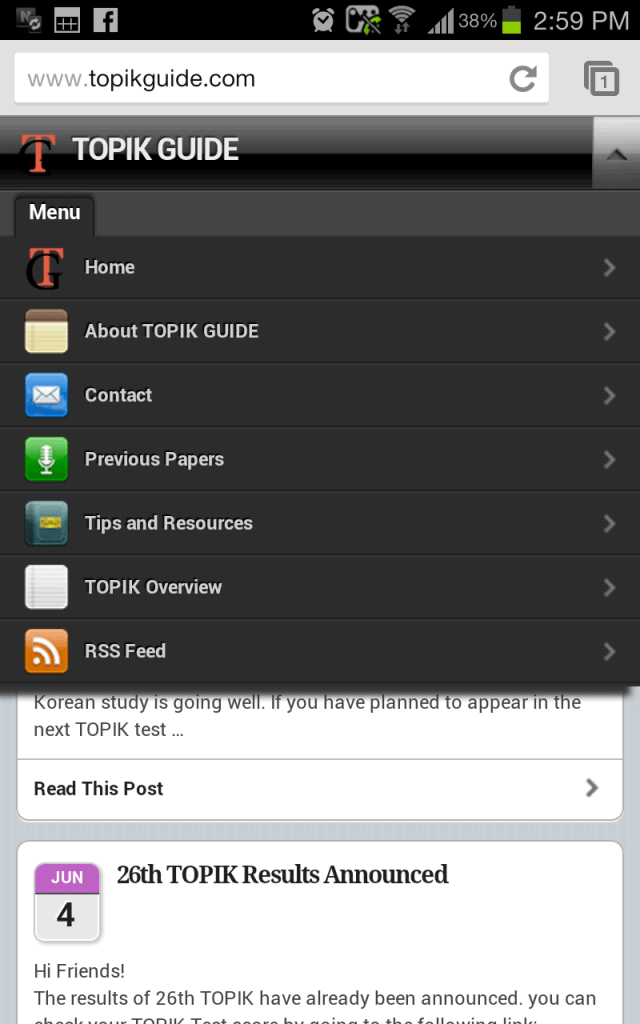
 So I thought of working on this issue and just yesterday I installed the mobile theme on the website server and now TOPIK GUIDE is perfectly optimized for viewing from the most popular mobile web browsing devices like the iPhone, iPod touch, Android mobile devices, Palm Pre/Pixi and BlackBerry OS6 mobile devices. In the mobile theme what you see is just a clean and sophisticated list of articles and not the header, sidebars and menus. When you click a post you get the content automatically adjusted to the screen size and resolution of your mobile phone. You can also access the menu items by clicking the arrow on top right corner. But in case you want the desktop version of the website on your phone screen, you can go to the bottom of the page and tap the mobile theme OFF button.
Just check TOPIK GUIDE on your mobile browser and let me know how you like it. 어때요? You can also leave your response with your phone by commenting on posts or clicking on ‘contact’ in the menu. In the end, I want to inform you that in the coming days you are going to see very useful content on TOPIK test on this website. My vacations have just started and I am working on it. Keep in Touch. Thank you 🙂


